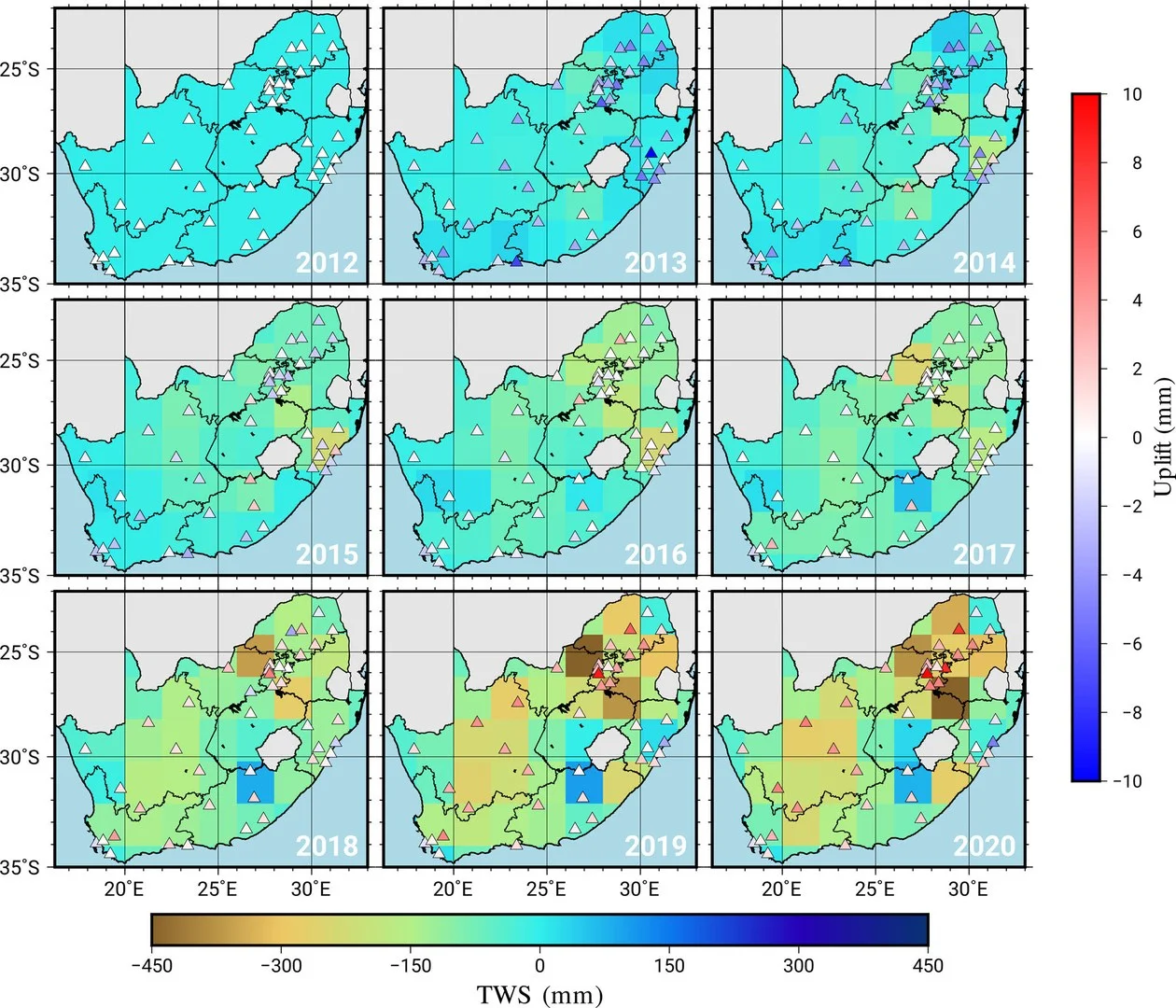
The graph shows the water losses and gains - in South Africa between 2012 and 2020. The browner the region, the higher the water loss. The triangles represent GPS stations. A red triangle means that this station has risen in height since 2012. leadimagesize2.webp image/webp Type image/webp Dimension Dimension 1260x1080 Size File size 197.0 KB Download View full-size image
